OVERVIEW
Northwestern Medicine aims to ensure a consistently safe environment for all patients, but inaccurate data collection in the Hygiene Hero platform led to user frustration and low form completion rates—directly impacting safety standards.
My team and I redesigned the hand hygiene reporting experience for both desktop and mobile to better support mandated reporters. After the redesign, total daily submissions and unique user participation increased, improving data accuracy and reinforcing safety compliance.
ROLE
UX Designer (Lead)
Worked with: 1 developer and stakeholders
TASKS
Interaction design
User Research
Usability testing
Prototyping
Visual Design
Stakeholder communication
TIMELINE
May 2024 - August 2024
TOOLS
Figma
CONTEXT
What’s Hygiene Hero?
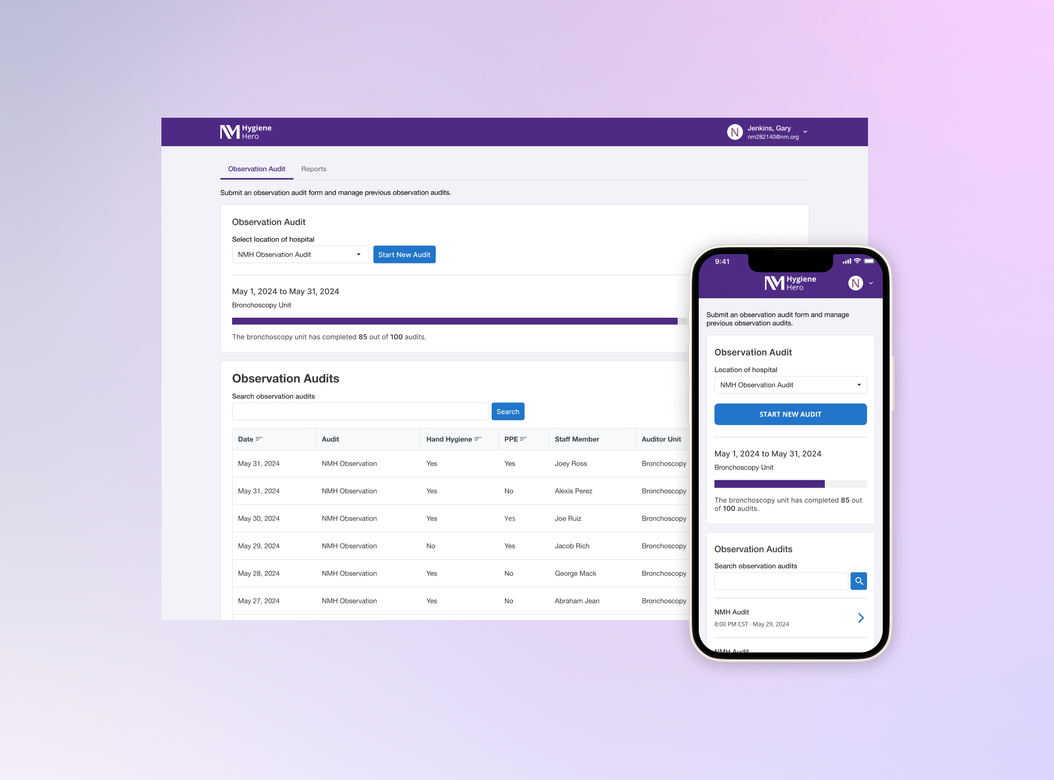
Hand hygiene plays a crucial role in preventing infections and maintaining a safe hospital environment. Hygiene Hero is a platform used by mandated reporters across 14 hospital locations to track compliance with hand hygiene and personal protective equipment (PPE) protocols.
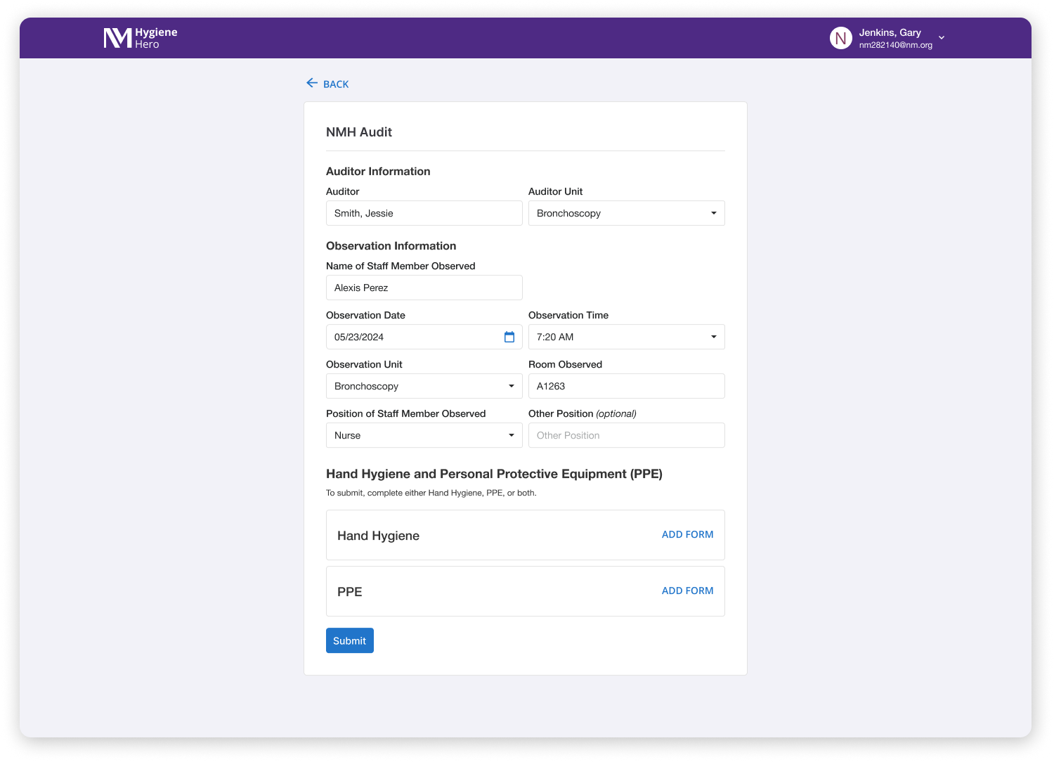
Auditors complete a form with details such as time, location, and the staff member observed. The form also includes sections on hand hygiene and PPE compliance. This data is collected and organized by location, helping each unit meet its required number of monthly audits to uphold safety standards.
PROBLEM
Inaccurate data.
No mobile support.
Inefficient workflow.
The current audit process lacks key fields, resulting in inaccurate data and incomplete audits. This makes it difficult for managers to track non-compliance and follow up effectively. Observers struggle with an inefficient workflow, which slows down reporting.
Additionally, no mobile experience limits auditors who are on the move, as they are unable to carry laptops for real-time submissions. The overall experience fails to meet best practices, affecting data accuracy and completion rates, and ultimately hindering safety and compliance efforts.
Let’s take
field notes
RESEARCH
12+ user interviews and contextual inquiries later
To better understand the challenges healthcare workers faced, I observed them using the application firsthand, helping me identify key pain points.
Some key questions I aimed to answer included:
What barriers prevent users from completing forms efficiently?
How might this redesign encourage more audit submissions?
What information is most critical for ensuring accurate compliance tracking?
GOAL
Improve accurate data collection
We want to empower healthcare workers to conduct audits efficiently, easily, and accurately, ensuring they can complete audits without obstacles to maintain hospital safety standards.
Reduce inaccurate audit data
Increase audit completion rates
Streamline the audit submission process
Iterate. Test.
Learn.
Repeat.
ITERATIVE DESIGN
A/B testing for mobile
Stepper design
8 participants tried filling in non-required fields, unsure if they could skip them.
Lack of clarity on optional vs. mandatory sections.
Participant Insights:
"I was a little unsure about what I should select. There wasn't an 'N/A' for the PPE section when it wasn't required." — Participant 3
"So with the Hand Hygiene and PPE one, I think it could be clearer from the start of the audit. If I could select whether I’m doing Hand Hygiene, PPE, or both, it would only show me the relevant screens." — Participant 1
RESULTS
Users want control over what to fill out
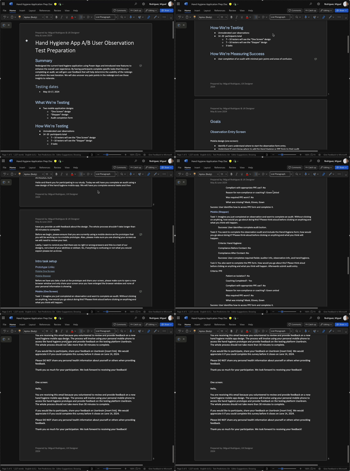
Given our research findings, I developed two design concepts to introduce a mobile audit experience for healthcare workers. To evaluate their effectiveness, we conducted remote moderated sessions with 17 testers.
Identify which design was the most user-friendly
Determine which design enabled users to successfully complete a Hand Hygiene and PPE audit
Gather insights to refine the final experience
One Screen design
All participants successfully completed the audits.
Everyone could locate and add Hand Hygiene and PPE.
A couple of participants noted they like completing the audits on mobile.
Testers had no complaints and found the prototype easy to follow.
Participant Insights:
"It’s pretty self-explanatory and filling in the things you observed." — Participant 5
Decision: Move forward with the one-screen option.
Participants found this design more intuitive.
While both designs received positive feedback, the one-screen option had slightly higher ratings.
If we had moved forward with the stepper, we would have added a skip button for Hand Hygiene and PPE to prevent confusion.
DESIGN SOLUTION
Introducing Hygiene Hero
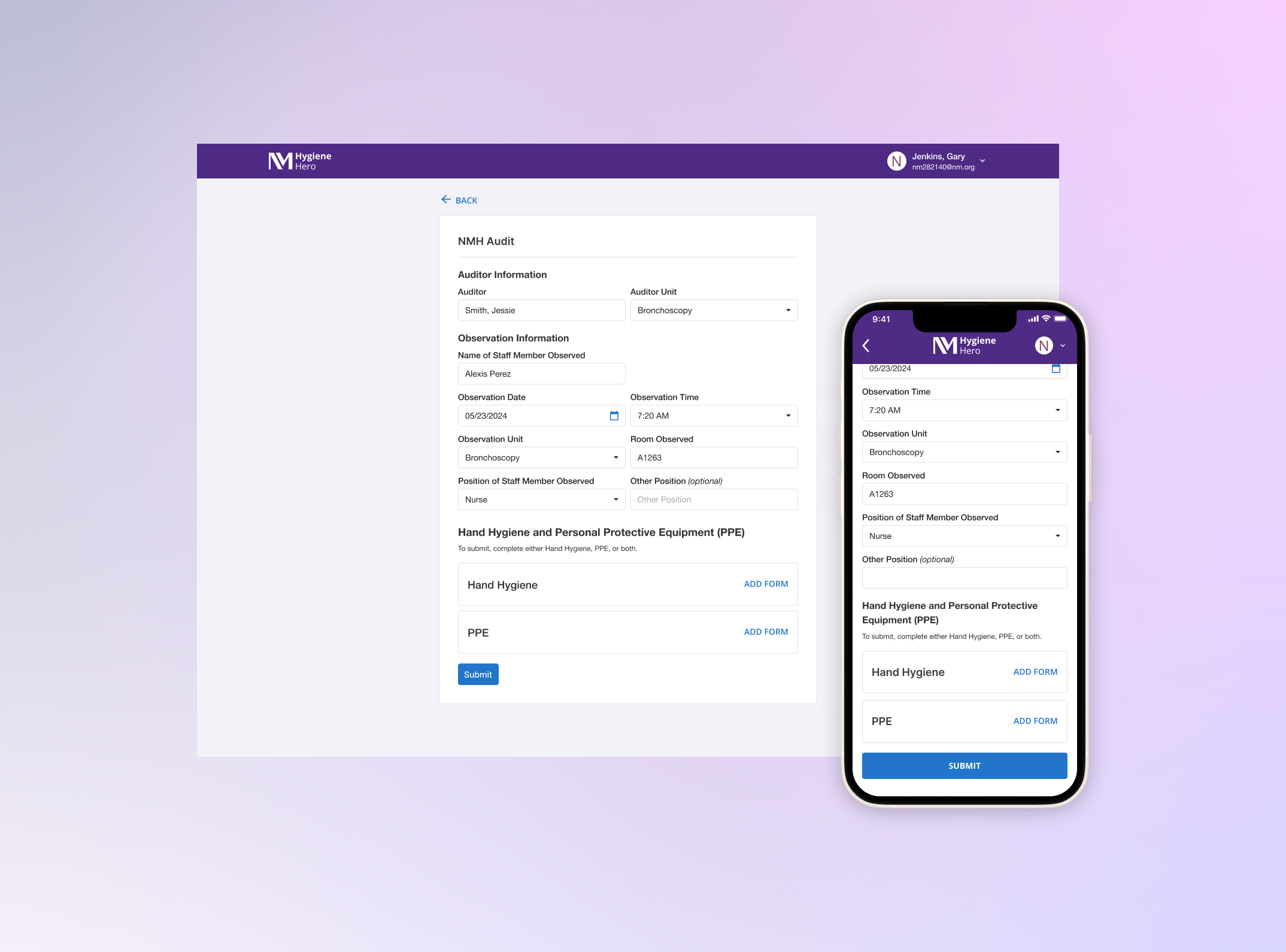
A smarter, more intuitive form
Developers initially opposed switching from a two-column layout, believing it reduced scrolling. However, best practices favor a single-column design for better readability, accessibility, and a natural flow when completing the form.
Clear Visual Grouping: Auditor details and observations are now distinctly labeled.
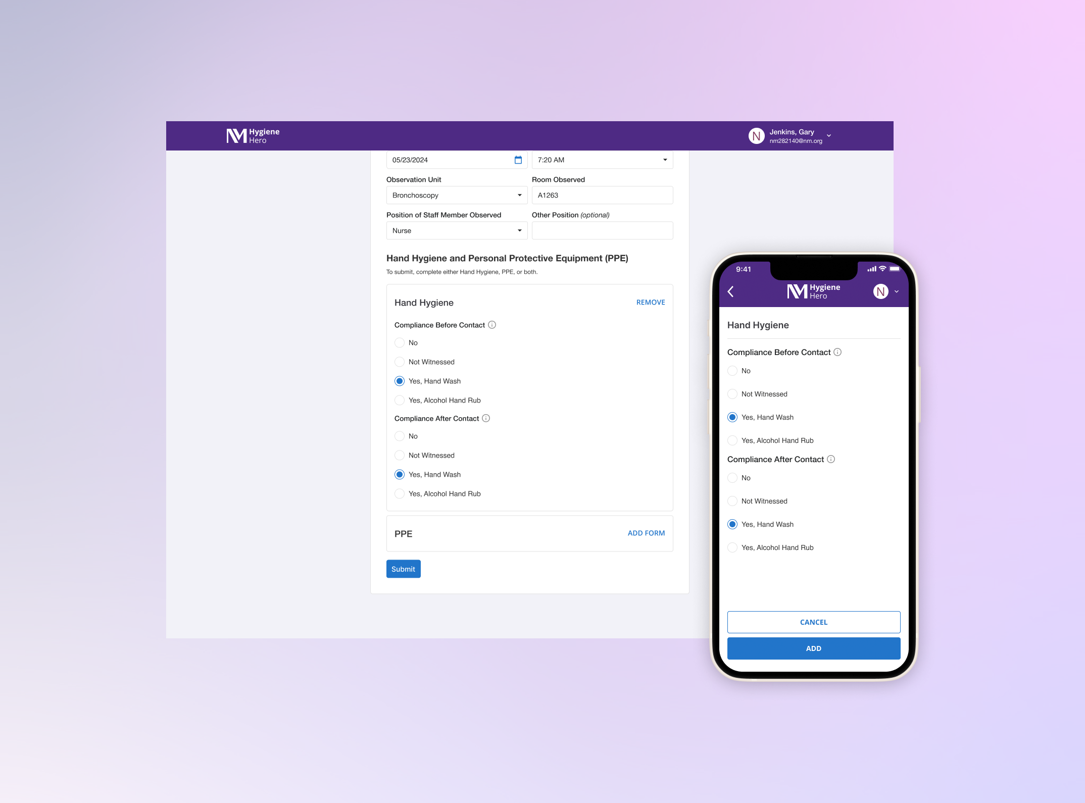
Streamlined Submission: Users can submit Hand Hygiene, PPE, or both. The "Add Form" button expands entries as needed.
Bringing audits to mobile
Healthcare workers needed a mobile-friendly solution. The new app allows users to quickly complete audits on the go. A/B testing confirmed the one-screen design as the most intuitive and efficient option.
RESULTS
More users.
Higher submissions.
Easier audits.
Safer hospitals
25%
Increase in daily submissions
90%
Users found it easy to use the Hygiene Hero
85.6k
Submissions since launch
NEXT STEPS
How might we encourage more audit submissions?
As we improve Hygiene Hero, including better mobile and tablet support, we can explore ways to increase participation to drive more audit submissions.
We currently track the top five highest submitters—this data could be used to introduce gamification, allowing users to see their own monthly and yearly submissions.
By making submissions more engaging, we can encourage consistency while reinforcing hospital safety.
REFLECTION
Learning from healthcare workers
Working on this project has been really rewarding, especially knowing it’s helping healthcare workers in hospitals across the Chicagoland area. I challenged myself by trying out different design ideas, presenting them to stakeholders, and testing with real users. I also visited nearby hospitals for walkthroughs, which gave me helpful insights to improve the design.
It’s exciting to see the new design launched and already making a difference. If I have more time before my next project, I’d keep gathering feedback and keep improving the experience.


