

OVERVIEW
As part of the workforce team, I worked in a cross-functional team to re-design and ship the volunteer web platform for Team NM. Team NM is an employee volunteer-hub that supports hospital community partner organizations and initiatives that address identified community health needs.
As the sole designer, I planned out the information architecture, drafted the user flow, and created wireframes from scratch. I also gathered insights from 10 moderated user tests and iterated designs.
ROLE
UX Designer (Lead)
Worked with: 2 developers and product manager
TASKS
Interaction design
User Research
Usability testing
Presenting
Stakeholder communication
TIMELINE
December 2024 - Present
TOOLS
Figma


RESEARCH
Understanding the current state of Team NM through contextual inquiries and user interviews
With any project, I start with questions.
What are the current concerns of the Team NM platform for volunteers?
How do volunteers currently register for events?
Through informative interviews (6) and contextual inquiries (3), I sought to answer these questions, which helped to clarify our goal. By defining project specs, we also prevented scope creep.
PROBLEM
Poor discoverability.
Inefficient registration.
Inconsistent experience.

Difficult event discovery
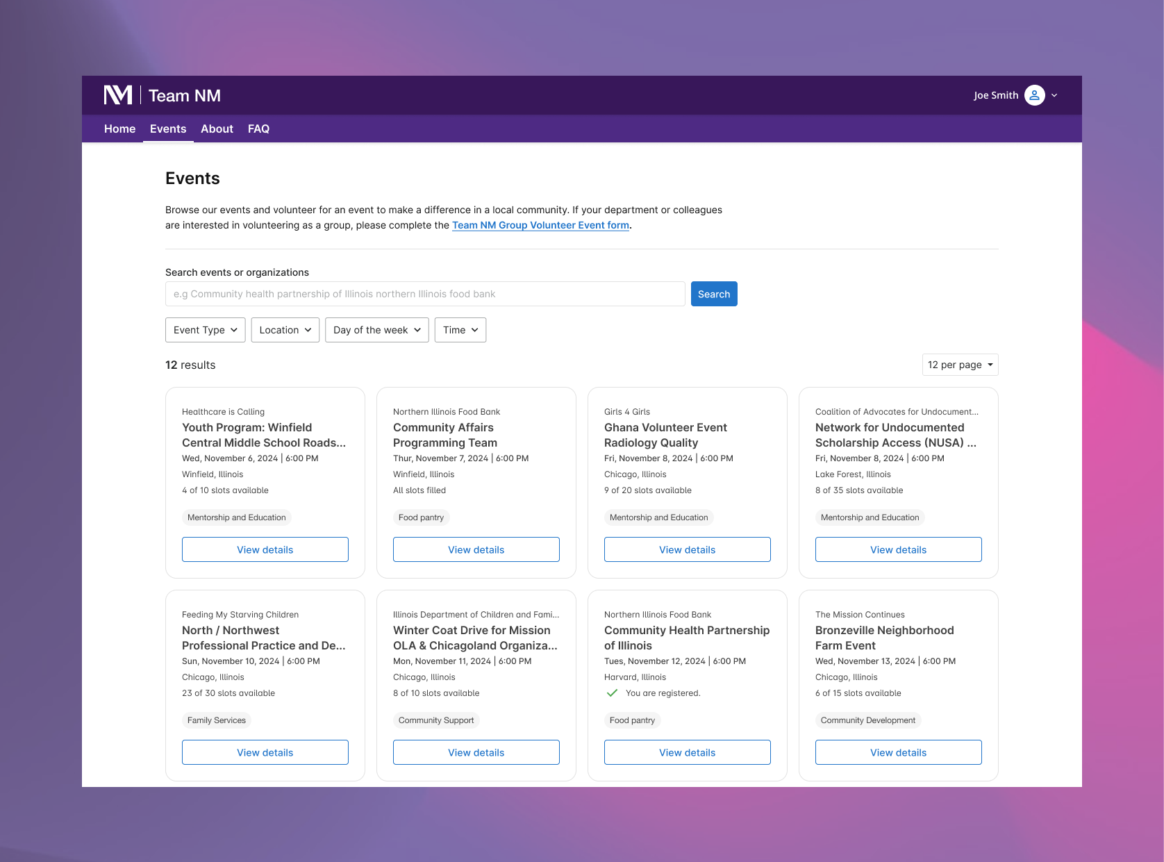
Finding relevant events was challenging due to a lack of filtering options, poor visual hierarchy, and an overwhelming list-based format.

Inefficient registration process
The registration experience lacked clarity and structure. Without clear guidance or feedback, users often felt uncertain about whether they had completed the process correctly.

Inconsistent event information
Event pages often lacked standardization—key details like date, time, and location were inconsistently displayed or buried in text, making it hard for users to plan and compare events.
GOAL
Simplify registration + discoverability experience.
We want to help volunteers perform their tasks efficiently and easily. Volunteers should be able to register on Team NM without obstacles.
Improve event discovery and navigation
Simplify and streamline registration
Ensure consistency and clarity
PRIORITIZE
Team NM volunteer user flow
Through our discovery process, we uncovered key challenges within Team NM. Given our tight timeline, we couldn’t address everything at once, so prioritization was essential. To focus our solutions, we identified the most common volunteer actions and conducted a workshop to organize features within a priority matrix.
Volunteers
Register for events --> Complete partner registration --> Review confirmation email --> attend and join future events.
USABILITY TESTING
3 major improvements in my design
I conducted usability testing with 10 volunteer users. Through this, we received information on what to iterate. Below are 3 topics that we learned more about, as well as the questions we asked to gain those insights.
Based on various feedback from our users + feedback with other team members, I continually iterated my design over the span of 2 weeks- with 3 major improvements.


DESIGN SOLUTION
Introducing the Team NM volunteer platform.
1 - Card design
Switching from a list format to a card-based layout makes it easier to read and quickly find key event details. Cards group information clearly, helping users compare options and decide faster.
2 - Simple, clear layout
Organized Content Sections – To enhance accessibility and clarity, the page is broken into distinct sections: Event Overview, Registration Details, Day-of-Event Information, Contact Details, and About the Organization.
Improved Readability – Key details are visually prioritized, reducing cognitive load and making it easier for volunteers to find important information at a glance.
3 - Smooth registration
Guided Progress – A clear progress bar keeps users on track.
Streamlined Experience – A full take-over page minimizes distractions.
Effortless Process – Information is introduced gradually to reduce cognitive load.
Time-Saving – Users can register for multiple roles in one go.


RESULTS
Faster volunteer registration
Easier discoverability
Less confusion
Happy volunteers
90%
Ease of navigation
90%
Users found it easy to use the platform.
9.5/10
User satisfaction
REFLECTION AND NEXT STEPS
Integrating feedback into ideation and enhancing the admin experience
Early Feedback Mattered – Gathering user input early in the process helped refine designs and kept us aligned with tight deadlines.
Bridging Perspectives – When presenting design solutions, I considered both business and development needs, supporting decisions with research, data, and transparency.
Future Enhancements – Explore deeper personalization, introduce gamification to highlight volunteer contributions with leaderboards, and improve the admin interface for event creation.